Behind the mark · The living field · SVZ concept system
We kept the circle. We put the heat back in it.
Vinci’s mark came to us as a still: a circle with a thermal gradient inside. Most rebrands would redraw it. We asked a simpler question — what is that gradient a picture of? — and the answer was heat, moving through something. So instead of repainting the mark we rebuilt the thing it was showing. Heat leaves a source, travels through a fluid, cools as it goes, and settles into the six colours you already own. Nothing here is painted. Every colour on screen is a temperature that got there by moving.
That gives you one solver, one palette and as many choreographies as you want. Every variation on this page changes only where the heat is born and how it travels, so picking a direction never splits the brand.
To be plain about it: this is brand behaviour that borrows from simulation. It is not a solver. Direction B takes the demo’s stated numbers — how concentrated the heat is, the board’s footprint, the layer count, the cooling sweep — and uses them as choreography. It only becomes evidence when Vinci’s own data drives it.
00 · Where it came from
We started with the sphere you already have.
Nobody at Vinci needs a new logo. You need the one you have to mean something. So we left the circle and the colours alone and gave the gradient a cause. Four steps got us from a still to a system, and each one is below.
- 01

The sphere Vinci has today
A gradient in a circle. Warm at the bottom, violet at the edge. People recognise it; it just doesn’t do anything yet.
- 02
The sphere given a process
Jackson Porter’s seven-second film. Heat comes in at one point, fills the circle, settles into the mark. Same object — now you have watched it happen.
- 03
The process leaves the logo
From simulation to identity. The field lives on a real object for a moment, then gathers itself back into the sphere. The logo and the evidence turn out to be the same motion. An SVZ concept film; a sketch of a future use, not a product shot.
- 04Live · move the pointerOpen full frame ↗
The system, live
The field running in a browser: one solver, your six colours, every choreography on this page, and frame-exact renders for film. Everything below is this, opened up.
That is the whole idea, and it is how we work on every brand: read the brief properly, understand the product down to the layer, keep what the client already owns, and give it a meaning it didn’t have. The rest of this page is that idea, opened up.
01 · The frames
What the heat did, frame by frame.
Seven entrances, captured from the live runtime at 0, 0.7, 1.5, 3, 5, 8 and 12 seconds. The first frame is empty on purpose. The mark isn’t there until the physics puts it there.
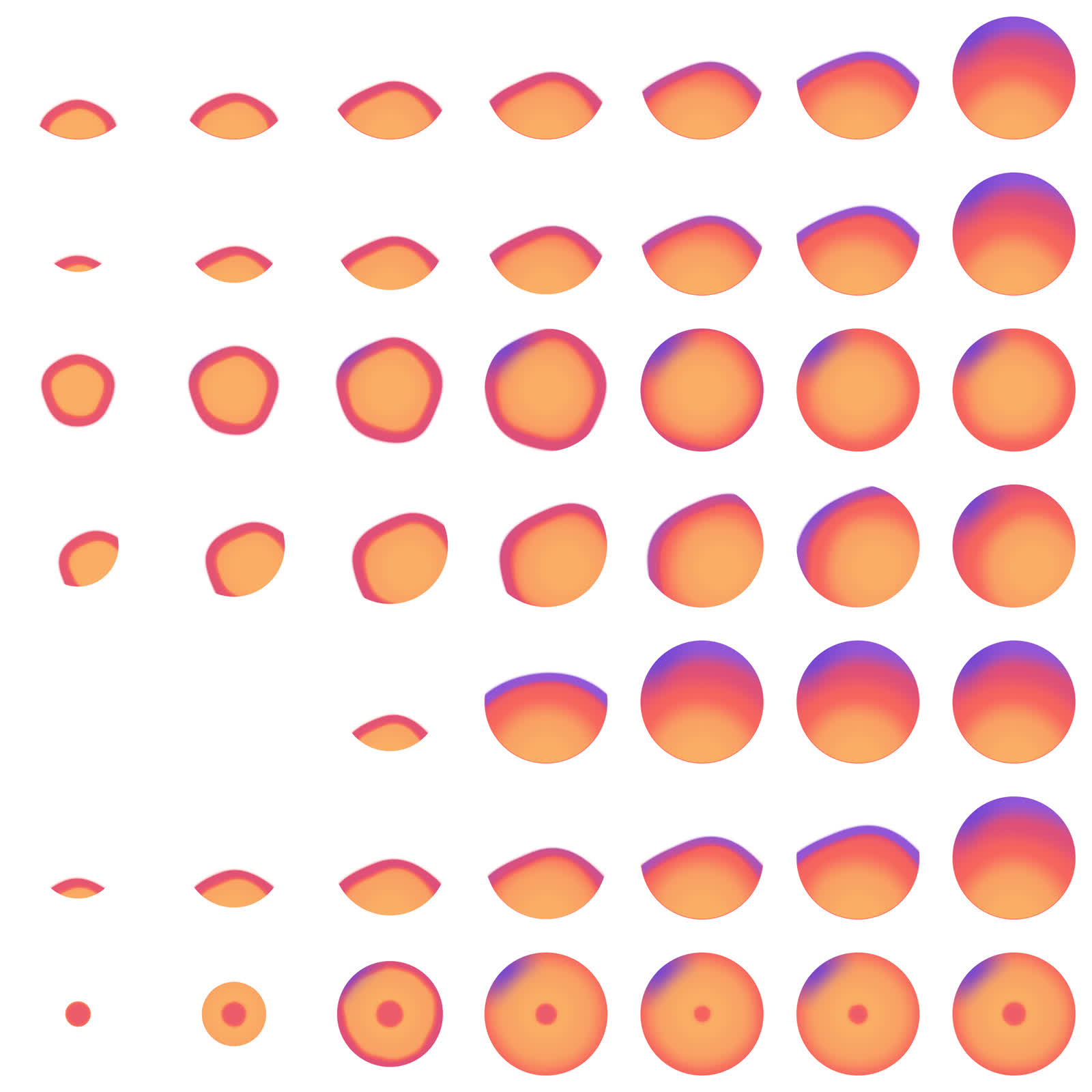
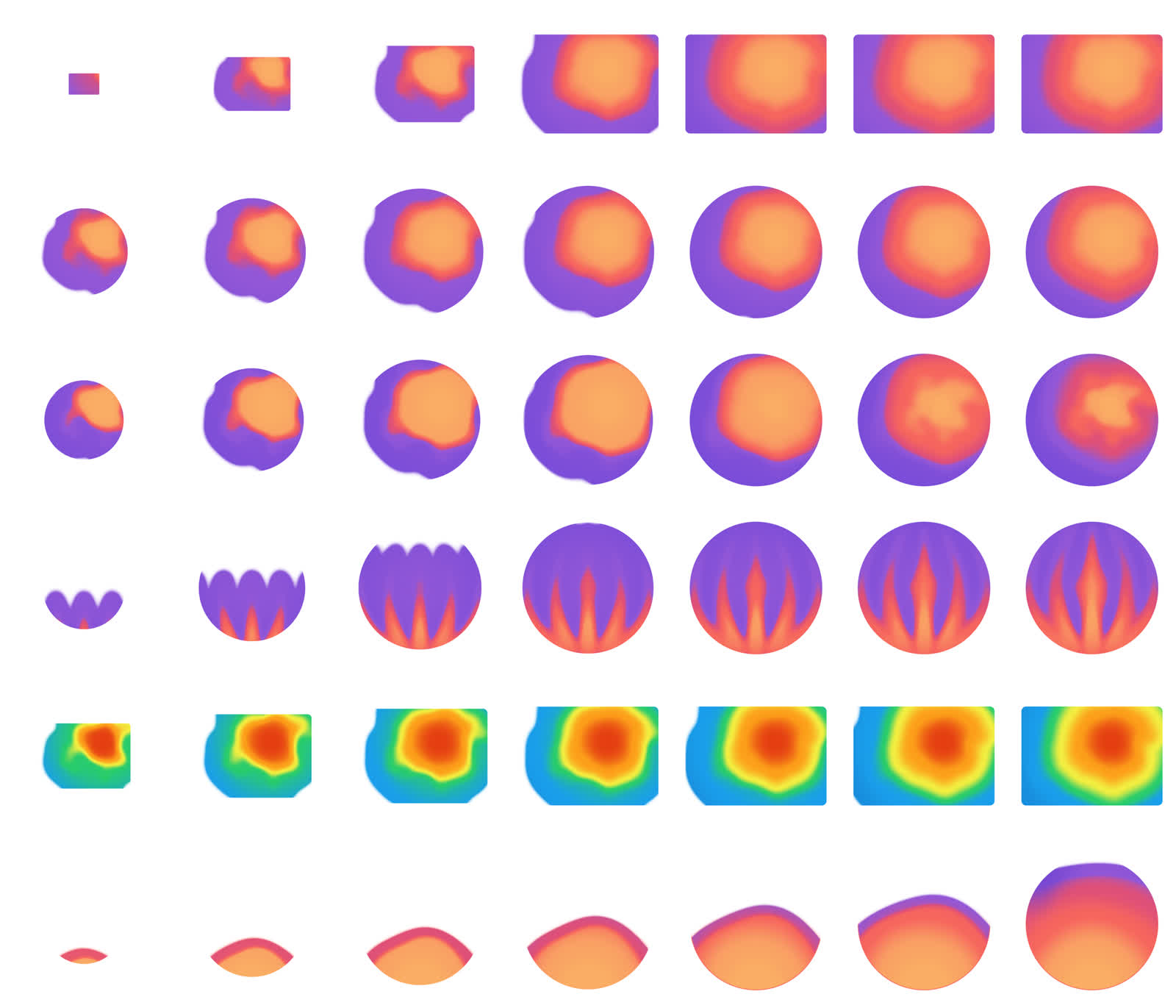
Every variation also renders from the same runtime at 30 frames a second, so the film, the deck and the website never disagree about what the mark looks like. Watch the eleven-loop reel ↗
02 · Direction A — the mark as a thermal object
Seven ways the heat can arrive.
Every tile is live. Reload the page and they all start again together. Once one has settled, move the pointer across it and it folds.
03 · Direction B — the field derived from the product
The same heat, arranged the way the product describes it.
Direction B borrows its shape from the two-and-a-half-minute product demo: heat where the power actually is, the board’s footprint, the eighteen layers, and the cooling sweep that turns a heat map into a requirement. It is the brand learning to speak the product’s language.
03b · Direction C — the evidence surface
The same field, in the colours engineers already trust.
Scott’s note on the board-in-product-colormap tile was “explore this more,” and he is right to. Brand colour and measurement colour do different jobs, and a physics company needs both without confusing them. Direction C is the bridge: the identical field, the identical geometry, painted in the engineering colormap from the demo. When Vinci’s own data drives it, this stops being a brand behaviour and becomes an evidence surface — a result page, an event screen, a figure in a paper — and it still looks like Vinci.
The rule we would write into the brand guidelines: the brand ramp means identity; the product ramp means a number. Never the other way round.
04 · Where the field travels
One field. Many containers.
- 01
Logo
The mark stops being a file and becomes a behaviour. It arrives, settles, and answers the pointer wherever it appears.
- 02
Loader + transitions
The ten-second fill is the loading state. Waiting looks like physics finishing, because it is.
- 03
Section fields
The same solver, turned down low, behind headlines and numbers. Pages breathe without a second motion system to maintain.
- 04
Product-data surfaces
Given Vinci’s real data, the same renderer becomes an evidence surface: actual temperatures, actual thresholds, the product’s own colours.
- 05
Objects + film
Every choreography renders frame-perfectly for film, decks, event screens and 3D materials. The web and the film agree to the frame.